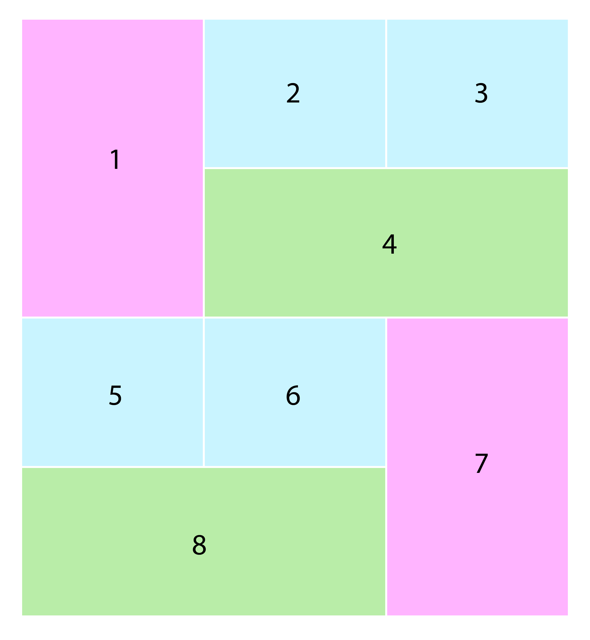
Flexbox can't do that with its own layout capabilities, it needs some help, so here is a CSS solution that assume the size of the items is given.
The main trick here is to add an extra element inside the li and make that the "styled" one, and use the li for the main layout.
The "light green" items gets a left/right margin, to push them accordingly, and with that make space for the "light purple".
Since a flex item (here the li) can't dynamically grow both vertical and horizontal, we instead use its inner div to take twice the height, and with that enable the requested layout.
This setup, combined with Flexbox's order property, will now make it very simply to adjust its layout using e.g. media query for a portrait layout (vertically stacked) etc.
Note, to make this all dynamically sized by its content, either a script or CSS Grid will be needed.
Here is a great post shedding some light (and more solutions) on Masonry:
Stack snippet
.masonry {
  margin: 48px -2px;
  padding-left: 0;
  list-style: none;
  align-items: flex-start;
  flex-wrap: wrap;
  display: flex;
}

.masonry li {
  flex-basis: calc(100% / 3);
  height: 200px;
  display: flex;
}

.masonry li div {
  display: relative;
  flex: 1;
  margin: 2px;
  text-align: center;
  display: flex;
  background-color: #C9F4FF;
}

.masonry li:nth-child(1) div,
.masonry li:nth-child(7) div {
  display: absolute;
  left: 0;
  top: 0;
  width: 100%;
  height: calc(200% - 4px);              /*  twice the height  */
  background-color: #FFB4FF;
}

.masonry li:nth-child(4),
.masonry li:nth-child(8) {
  flex-basis: 100%;                      /*  100% width to force wrap  */
}

.masonry li:nth-child(4) div,
.masonry li:nth-child(8) div {
  background-color: #B9EDA8;
}

.masonry li:nth-child(4) div {
  margin-left: calc((100% / 3) + 2px);   /*  pushed to left  */
}

.masonry li:nth-child(8) div {
  margin-right: calc((100% / 3) + 2px);  /*  pushed to right  */
}
<!-- masonry starts -->
<ul class="masonry">
<li><div> </div></li>
<li><div> </div></li>
<li><div> </div></li>
<li><div> </div></li>
<li><div> </div></li>
<li><div> </div></li>
<li><div> </div></li>
<li><div> </div></li>
</ul>
<!-- masonry ends -->
与恶龙缠斗过久,自身亦成为恶龙;凝视深渊过久,深渊将回以凝视…