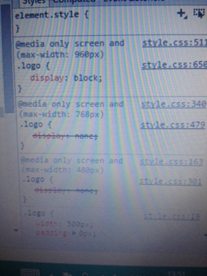
I'm confused because the logo should be hidden if width is less than 748px. However all sizes below 960px width show the logo.
What am I missing here?
See Question&Answers more detail:os

I'm confused because the logo should be hidden if width is less than 748px. However all sizes below 960px width show the logo.
What am I missing here?
See Question&Answers more detail:os
(In the screenshot of the screen) I see that the max-width: 768px media query is declared before max-width: 960px which is incorrect. Media queries that only use max-width should be sorted descending. Let us assume that you declare media queries in this order:
(max-width: 768px)(max-width: 960px)If your screen is 400px wide then both media queries will match the condition. In this case the media query block declared later wins.
Solution:
Sort your max-width rules descending (larger widths first).
Or use mutually exclusive media query blocks such as this:
(min-width: 961px)(min-width: 769px) and (max-width: 960px)(max-width: 768px)In this case order does not matter.
