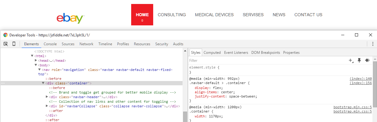
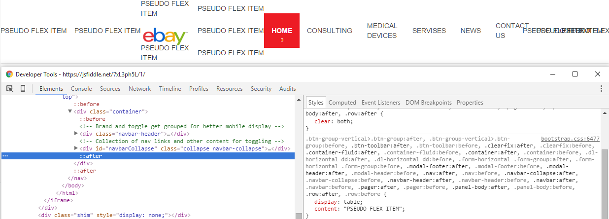
I needed to use flexbox to center my navigation and hence I came up with the following:
.navbar-brand > img {
width: 100px;
}
.navbar-default {
background-color: #fff;
border-color: #fff;
-webkit-box-shadow: 0 0 3px rgba(0, 0, 0, .3);
box-shadow: 0 0 3px rgba(0, 0, 0, .3);
}
.navbar-default .navbar-nav > li > a {
color: #464646;
text-transform: uppercase;
}
.navbar-default .navbar-nav > li > a:hover,
.navbar-default .navbar-nav > li > a:focus,
.navbar-default .navbar-nav > li > a:active {
color: #727272;
}
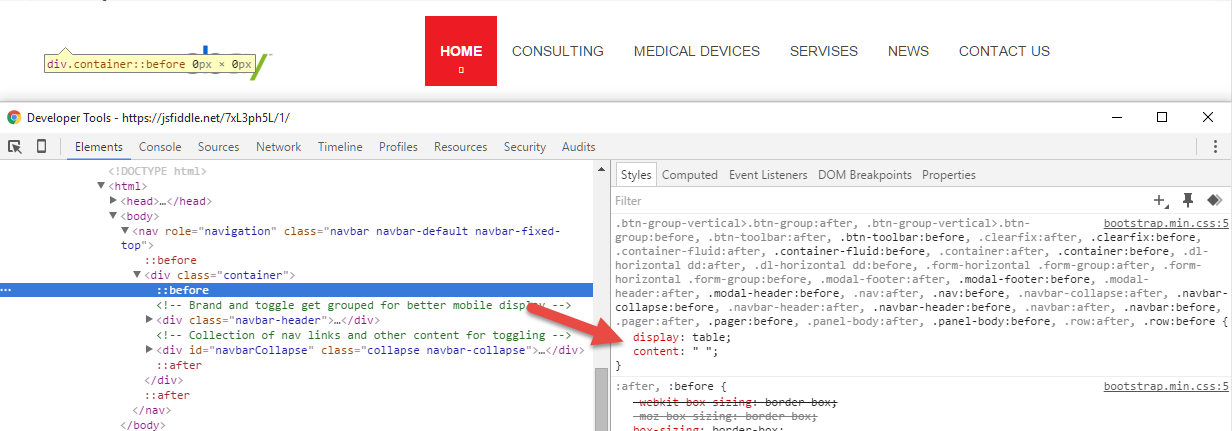
.navbar-default .navbar-nav > li:not(.active) > a:before {
content: '';
position: absolute;
bottom: 0;
left: 30%;
right: 30%;
height: 1px;
background: #ed1c24;
opacity: 0;
-webkit-transform: translateY(10px);
-ms-transform: translateY(10px);
-o-transform: translateY(10px);
transform: translateY(10px);
-webkit-transition: all .3s;
-o-transition: all .3s;
transition: all .3s;
}
.navbar-default .navbar-nav > li > a:hover:before {
opacity: 1;
-webkit-transform: none;
-ms-transform: none;
-o-transform: none;
transform: none;
}
.navbar-default .navbar-nav > li:first-child > a {
font-weight: 700;
}
.navbar-default .navbar-nav > li.active > a {
background: #ed1c24;
color: #fff;
padding-top: 25px;
padding-bottom: 25px;
position: relative;
-webkit-transition: all .3s;
-o-transition: all .3s;
transition: all .3s;
}
.navbar-default .navbar-nav > li.active > a:hover,
.navbar-default .navbar-nav > li.active > a:focus,
.navbar-default .navbar-nav > li.active > a:active {
background: #e0222a;
color: #fff;
}
.navbar-default .navbar-nav > li.active:hover > a:after {
bottom: 0;
}
.navbar-default .navbar-nav > li.active > a:after {
font-family: FontAwesome;
content: 'f078';
position: absolute;
bottom: 5px;
font-size: 0.6em;
/*opacity: 0.8;*/
left: 50%;
-webkit-transform: translateX(-50%);
-ms-transform: translateX(-50%);
-o-transform: translateX(-50%);
transform: translateX(-50%);
-webkit-transition: all .3s;
-o-transition: all .3s;
transition: all .3s;
}
/* use flexbox to center align nav elements above 992px */
@media (max-width: 992px) {
.navbar-default .navbar-nav > li > a {
text-align: center;
}
.navbar-collapse {
max-height: 350px;
overflow-y: hidden;
}
}
@media (min-width: 992px) {
.navbar-default {
display: flex;
align-items: center;
justify-content: space-between;
}
.navbar-default {
min-height: 100px;
}
.navbar-default .navbar-right {
display: flex;
align-items: center;
}
.navbar-default > .container {
display: flex;
align-items: center;
justify-content: space-between;
}
}<link href="https://maxcdn.bootstrapcdn.com/bootstrap/3.3.6/css/bootstrap.min.css" rel="stylesheet" />
<nav role="navigation" class="navbar navbar-default navbar-fixed-top">
<div class="container">
<!-- Brand and toggle get grouped for better mobile display -->
<div class="navbar-header">
<button type="button" data-target="#navbarCollapse" data-toggle="collapse" class="navbar-toggle">
<span class="sr-only">Toggle navigation</span>
<span class="icon-bar"></span>
<span class="icon-bar"></span>
<span class="icon-bar"></span>
</button>
<a href="index.html" class="navbar-brand">
<img src="https://upload.wikimedia.org/wikipedia/commons/4/48/EBay_logo.png" alt="Logo">
</a>
</div>
<!-- Collection of nav links and other content for toggling -->
<div id="navbarCollapse" class="collapse navbar-collapse">
<ul class="nav navbar-nav navbar-right">
<li class="active"><a href="index.html">Home</a>
</li>
<li><a href="consulting.html">CONSULTING</a>
</li>
<li><a href="devices.html">Medical Devices</a>
</li>
<li><a href="">Servises</a>
</li>
<li><a href="">News</a>
</li>
<li><a href="">Contact Us</a>
</li>
</ul>
</div>
</div>
</nav>