Welcome to ShenZhenJia Knowledge Sharing Community for programmer and developer-Open, Learning and Share
menu search
person
Welcome To Ask or Share your Answers For Others

Categories

I would like to find a way to have elements in a single container wrap to a new line going the opposite direction of the previous line, like a snake curving back on itself. I have not been able to achieve this result with flexbox and any combination of flex-direction and flex-wrap properties.

Image comparison of flexbox result vs desired result:

Image comparison of flexbox result vs desired result

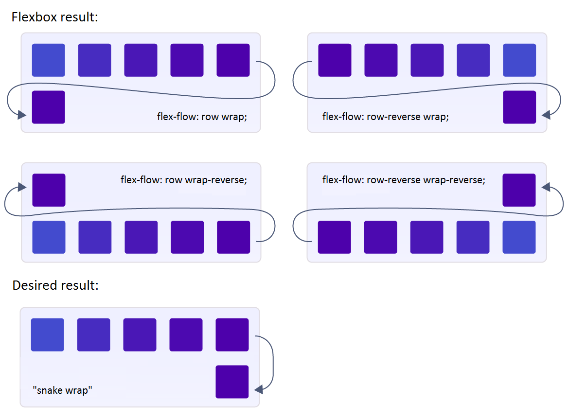
And here is a snippet showing the flexbox result vs desired result (faked):

body {
  font: 400 14px 'Arial', sans-serif;
}

.title {
  font-size: 1em;
  padding: 20px 0;
}

.title:first-child {
  padding: 0 0 20px;
}

.flex-container, .fake-container, .fake-row {
  width: 500px;
  background: orange;
  display: flex;
}

.flex-container {
  flex-flow: row wrap; /* any combination of row/reverse & wrap/reverse */
}

.item {
  display: inline-block;
  background: purple;
  width: 80px;
  max-width: 80px;
  height: 80px;
  margin: 10px;
  line-height: 80px;
  color: white;
  font-weight: bold;
  font-size: 2em;
  text-align: center;
}

.fake-container {
  flex-flow: column nowrap;
}

.fake-row {
  flex-flow: row wrap;
  height: 100px;
}

.fake-row:nth-child(2) {
  flex-flow: row-reverse wrap;
}
<div class="title">Flexbox result:</div>
<div class="flex-container">
  <div class="item">1</div>
  <div class="item">2</div>
  <div class="item">3</div>
  <div class="item">4</div>
  <div class="item">5</div>
  <div class="item">6</div>
  <div class="item">7</div>
</div>

<div class="title">Desired result (faked):</div>
<div class="fake-container">
  <div class="fake-row">
    <div class="item">1</div>
    <div class="item">2</div>
    <div class="item">3</div>
    <div class="item">4</div>
    <div class="item">5</div>
  </div>
  <div class="fake-row">
    <div class="item">6</div>
    <div class="item">7</div>
  </div>
</div>
See Question&Answers more detail:os

与恶龙缠斗过久,自身亦成为恶龙;凝视深渊过久,深渊将回以凝视…
thumb_up_alt 0 like thumb_down_alt 0 dislike
553 views
Welcome To Ask or Share your Answers For Others

1 Answer

A CSS grid solution similar to this one that works with a fixed number of elements per row (aka fixed number of columns).

.flex-container {
  width: 500px;
  background: orange;
  display: grid;
  grid-template-columns:repeat(5,1fr); /*define the number of column*/
  grid-auto-flow:dense; /* this is important to fill all the space*/
  grid-gap:20px;
  padding:10px;
}

.item {
  background: purple;
  height: 80px;
  line-height: 80px;
  color: white;
  font-weight: bold;
  font-size: 2em;
  text-align: center;
}

.item:nth-child(10n + 6)  {grid-column:5}
.item:nth-child(10n + 7)  {grid-column:4}
.item:nth-child(10n + 8)  {grid-column:3}
.item:nth-child(10n + 9)  {grid-column:2}
/*.item:nth-child(10n + 10) {grid-column:1} not needed*/
/* For N = number of columns 
  .item:nth-child((2xN)n + (N+1)) { grid-column:N; }
  .item:nth-child((2xN)n + (N+2)) { grid-column:(N-1); }
  ....
  .item:nth-child((2xN)n + (2xN)) { grid-column:1; }

*/

.item:before {
  content:counter(num);
  counter-increment:num;
}
body {
  font: 400 14px 'Arial', sans-serif;
  counter-reset:num;
}
<div class="flex-container">
  <div class="item"></div>
  <div class="item"></div>
  <div class="item"></div>
  <div class="item"></div>
  <div class="item"></div>
  <div class="item"></div>
  <div class="item"></div>
  <div class="item"></div>
  <div class="item"></div>
  <div class="item"></div>
  <div class="item"></div>
  <div class="item"></div>
  <div class="item"></div>
  <div class="item"></div>
  <div class="item"></div>
  <div class="item"></div>
  <div class="item"></div>
  <div class="item"></div>
</div>

与恶龙缠斗过久,自身亦成为恶龙;凝视深渊过久,深渊将回以凝视…
thumb_up_alt 0 like thumb_down_alt 0 dislike
Welcome to ShenZhenJia Knowledge Sharing Community for programmer and developer-Open, Learning and Share
...