

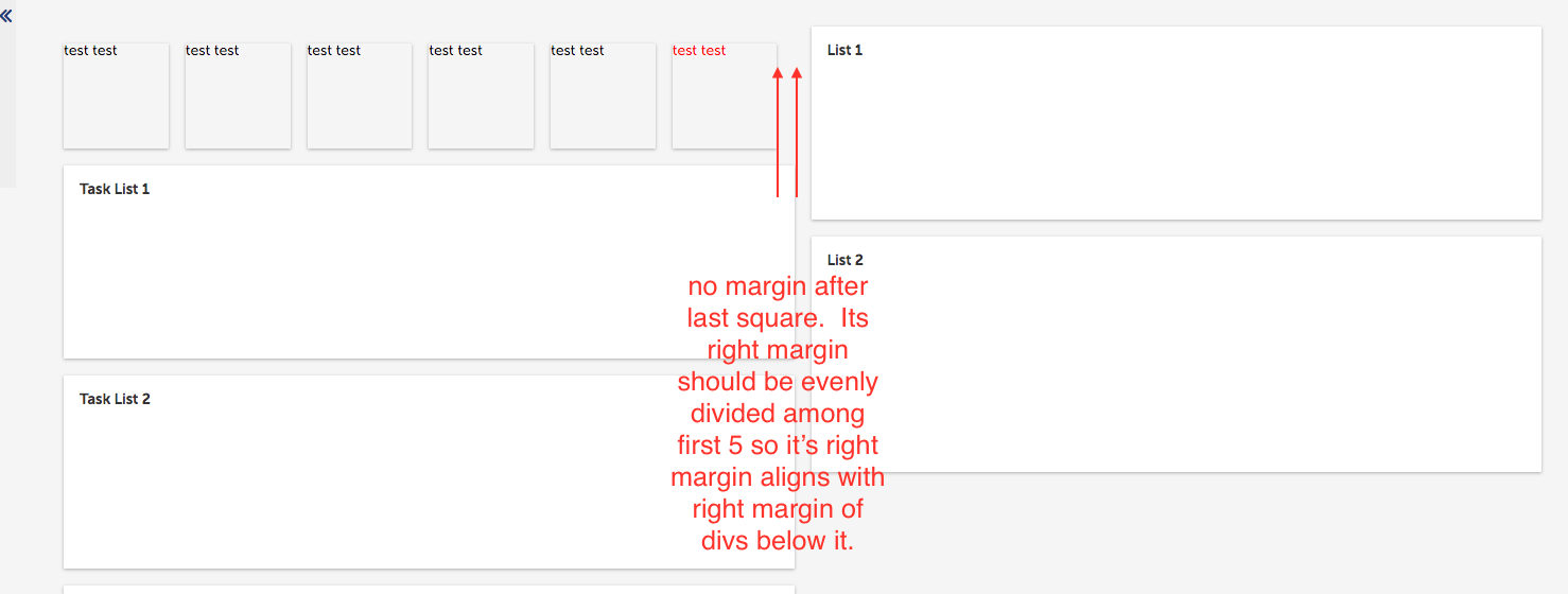
I have a page that is 50/50 wide. The left half has a row with six divs. Criteria:
- 6 squares must always remain square.
- First 5 squares should have margin/padding to right for separation.
- All six squares must stay on same single row. If I can get that to work i can make the needed adjustments for responsiveness in smaller viewports.
- Cross browser compatible for newest version of ie, chrome, and firefox.
My codepen: https://codepen.io/johnsontroye/pen/zzNVBr
Image:
<body>
  <div class="container">
    <div class="column" style="margin-right: 20px">
      <div class="flex-container">
        <div class="flex-item">
          <div class="flex-item-inner">
            <div class="flex-item-inner-content">
              L1
            </div>
          </div>
        </div>
        <div class="flex-item">
          <div class="flex-item-inner">
            <div class="flex-item-inner-content">
              L2
            </div>
          </div>
        </div>
        <div class="flex-item">
          <div class="flex-item-inner">
            <div class="flex-item-inner-content">
              L3
            </div>
          </div>
        </div>
        <div class="flex-item">
          <div class="flex-item-inner">
            <div class="flex-item-inner-content">
              L4
            </div>
          </div>
        </div>
        <div class="flex-item">
          <div class="flex-item-inner">
            <div class="flex-item-inner-content">
              L5
            </div>
          </div>
        </div>
        <div class="flex-item">
          <div class="flex-item-inner">
            <div class="flex-item-inner-content">
              L6
            </div>
          </div>
        </div>
      </div>
    </div>

    <div class="column" style="margin-left: 20px; border: 1px black solid; height: 500px">

        Other stuff

  <div>
</body>


.container {
  display: flex;
  flex-direction: row;
  padding: 25px;
  border: 2px red solid;
}

.column {
  width: 100%;
  height: 100%;
  float: left;
}

.flex-container {
  padding: 0;
  font-size: 0;
  border: 1px solid black;
  box-sizing: border-box;
}

.flex-item {
  position: relative;
  display: inline-block;
  height: 0;
  width: 100%;
  padding-top: 100%;
  border: 1px black solid;
  font-size: 20px;
  color: black;
  font-weight: bold;
  text-align: center;
  box-sizing: border-box;
}
@media (min-width: 480px) {
  .flex-item {
    width: 33.3333%;
    padding-top: 33.3333%;
  }
}
@media (min-width: 768px) {
  .flex-item {
    width: 16.6666%;
    padding-top: 16.6666%;
  }
}
.flex-item-inner {
  position: absolute;
  display: flex;
  justify-content: center;
  align-items: center;
  top: 0;
  bottom: 0;
  right: 0;
  left: 0;
  margin-right: 25px;
  background: white;
  border: 1px solid red;
  box-sizing: border-box;
}
.flex-item-inner-content {
  border: 1px solid orange;
}

.flex-item:last-child .flex-item-inner {
  margin-right: 0;
  color: green;
}

