

In today's web development community, It is almost 'standard practise' to make a website "fully responsive" - meaning it would work on all screen sizes.
I currently have a website that is designed for a set width and height of 900 * 600px. However, I would like to alter this in such a way that I can make it mobile responsive, without loosing its functionality.
I was looking for some 'industry standard' concepts in which I could adapt to this purpose, although I am at a slight loss as to how 'professionals' would go about achieving this in real world situations?
+---------------------------------------+
|     NAVBAR (900px)                    |
+---------------------------------------+
|      |                                |
|      |                                |
|      |           body                 |
|200px |          (700px)               |
|      |                                |
|      |                                |
|      |                                |
|      |                                |
+---------------------------------------+
Here's a quick demo of a layout design which suits the 900 * 600px screen:
.page-wrap {
  height: 600px;
  width: 900px;
  background: lightgray;
  position: absolute;
  top: 0;
  left: 0;
}
.nav {
  position: absolute;
  top: 0;
  left: 0;
  height: 50px;
  width: 900px;
  background: tomato;
}
.sidebar {
  position: absolute;
  top: 50px;
  left: 0;
  height: 550px;
  width: 200px;
  background: dimgray;
}
.nav a {
  display: inline-block;
  height: 50px;
  width: 100px;
  line-height: 50px;
  text-decoration: none;
  background: rgba(200, 200, 200, 0.4);
}
.nav a:hover {
  background: transparent;
}
<div class="page-wrap">
<div class="nav">
<a href="#">nav bar item</a><a href="#">nav bar item</a><a href="#">nav bar item</a><a href="#">nav bar item</a><a href="#">nav bar item</a>
</div>
<div class="sidebar">
</div>
</div>
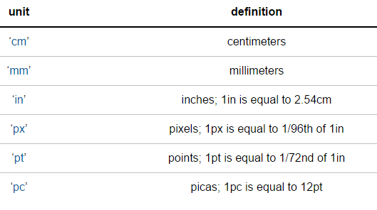
 ~Image from
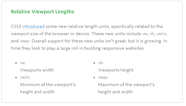