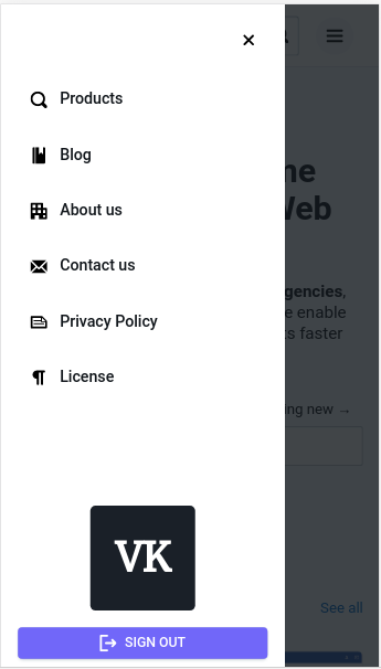
i have a bootstrap 4 navbar( like the default navbar which collpase from top to bottom). Now what is want is, i want to convert this navbar into a sidebar for mobile version. i want something like this my code so far:
<nav class="navbar navbar-expand-lg navbar-light bg-light sticky-top mb-4">
        <a href="{{ url_for('home') }}"><img src="{{ url_for('static', filename='dist/img/web3.svg') }}" alt="Example Navbar 1" class="mr-2" height="30"></a>
        <a class="navbar-brand"></a>
        <button class="navbar-toggler" type="button" data-toggle="collapse" data-target="#navbarNavDropdown-7" aria-controls="navbarNavDropdown-7" aria-expanded="false" aria-label="Toggle navigation">
            <span class="navbar-toggler-icon"></span>
        </button>
        <div class="collapse navbar-collapse" id="navbarNavDropdown-7">
            <ul class="navbar-nav mr-auto">
                <li class="nav-item active">
                    <a class="nav-link" href="{{ url_for('home') }}" style="font-size:18px;">Home
                        <span class="sr-only">(current)</span>
                    </a>
                </li>
                <li class="nav-item">
                    <a class="nav-link" href="{{ url_for('my_dashboard') }}" style="font-size:18px;">Dashboard</a>
                </li>
                <li class="nav-item dropdown">
                <a class="nav-link" href="#" id="navbarDropdown" role="button" data-toggle="dropdown" aria-haspopup="true" aria-expanded="false">
                <i class="fas fa-ellipsis-h"></i>
                </a>
                <div class="dropdown-menu" aria-labelledby="navbarDropdown">
                    <a class="dropdown-item" href="{{ url_for('getting_feedback')}}">Feedback</a>
                    <a class="dropdown-item" href="{{ url_for('donate_books') }}">Donate books</a>
                    <a class="dropdown-item" href="{{ url_for('requesting_for_books') }}">Request books</a>
                    <div class="dropdown-divider"></div>
                    <a class="dropdown-item" href="{{ url_for('about_page') }}">About</a>
                    <a class="dropdown-item" href="{{ url_for('about_page') }}">Blog</a>
                </div>
                </li>
            </ul>
            <div class="ml-auto">
                {% if session['username'] %}
                <ul>
                    <li class="nav-item dropdown">
                            <a class="nav-link dropdown-toggle" id="navbarDropdownMenuLink-333" data-toggle="dropdown" aria-haspopup="true" aria-expanded="false">
                                <img src="{{ url_for('static', filename='dist/img/iam.png') }}" alt="" height="27">
                            </a>
                            <div class="dropdown-menu dropdown-menu-right"
                                aria-labelledby="navbarDropdownMenuLink-333">
                                <a class="dropdown-item" href="{{ url_for('my_dashboard') }}"><img src="{{ url_for('static', filename='dist/img/user3.png') }}" alt="" height="20" class="pr-2">Account</a>
                                <a class="dropdown-item" href="{{ url_for('logging_user_out') }}"><img src="{{ url_for('static', filename='dist/img/exit-door.png') }}" alt="" height="20" class="pr-2">Log out</a>
                            </div>
                </li>
            </ul>
                {% else %}
                <span>
                    <a class="btn btn-outline-primary btn-pill mx-auto my-auto" href="#" data-toggle="modal" data-target="#modalLoginForm">Sign in</a>
                </span>
                {% endif %}
            </div>
        </div>
    </nav>