

I have a responsive web design with a SVG logo/image which is dynamic with its container. All major browsers seem to support SVG really good.
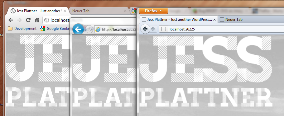
My SVG is dynamic, so if I scale up my browser window, the SVG does it too. In Chrome and IE9 it works like a charm. In Firefox the SVG is blurry at some sizes. But I can't say its all the time blurry when it's over the initial SVG size. It just seems not to rerender correctly all the time while I'm scaling up my browser window.
That's what it looks like sometimes (have a look at it in fullsize to see the difference):
Maybe I'm using the wrong way to embed it. That's what my CSS and HTML look like:
<div id="logo"></div>
CSS:
#logo {
   background-image: url('http://dl.dropbox.com/u/569168/jess.svg');
   height: 22em;
   background-repeat: no-repeat;
   -webkit-background-size: 100%;
   -moz-background-size: 100%;
   -o-background-size: 100%;
   background-size: 100%;
}
Grab the SVG with the link in the CSS if you want to have a look at it. It's made with Adobe Illustrator.
Any idea how to fix that?
See Question&Answers more detail:os
