

I'm trying to adjust Bootstrap tabs to make them span the full width of their container. Here's my code (a minimal working example):
<!doctype html>
<html lang="en">
    <head>
        <meta charset="UTF-8">
        <title>Full Width Tabs using Bootstrap</title>
        <link href="http://twitter.github.com/bootstrap/assets/css/bootstrap.css" rel="stylesheet">
        <style>
            .full-width-tabs > ul.nav.nav-tabs {
                display: table;
                width: 100%;
                table-layout: fixed; /* To make all "columns" equal width regardless of content */
            }
            .full-width-tabs > ul.nav.nav-tabs > li {
                float: none;
                display: table-cell;
            }
            .full-width-tabs > ul.nav.nav-tabs > li > a {
                text-align: center;
            }
        </style>
    </head>
    <body>
        <div class="tabbable full-width-tabs">
            <ul class="nav nav-tabs">
                <li class="active"><a href="#tab-one" data-toggle="tab">Tab 1</a></li>
                <li><a href="#tab-two" data-toggle="tab">Tab 2</a></li>
            </ul>
            <div class="tab-content">
                <div class="tab-pane active" id="tab-one">
                    I'm in Tab 1.
                </div>
                <div class="tab-pane" id="tab-two">
                    Howdy, I'm in Tab 2. Howdy, I'm in Tab 2. Howdy, I'm in Tab 2. Howdy, I'm in Tab 2.
                </div>
            </div>
        </div> <!-- /tabbable -->

        <script src="http://code.jquery.com/jquery-1.9.1.js"></script>
        <script src="http://netdna.bootstrapcdn.com/twitter-bootstrap/2.3.2/js/bootstrap.min.js"></script>

    </body>
</html>
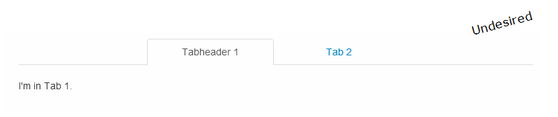
I get this (undesired) result:
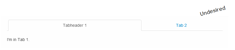
However, I want the tab "headers" to span the entire width of the tab container - and distribute their individual width's evenly, something like this desired result:

How do I achieve that?
Update 1: Here's a JSFiddle: http://jsfiddle.net/agib/FZy4n/
Update 2: I already had a working widget using custom javascript. However, I'm looking for a solution that integrates seemlessly with Bootstrap and thus relies only on standard Bootstrap javascript.
Update 3: If I remove / comment out
/* table-layout: fixed; */
header widths are taking up all horizontal space as needed. However, their widths are resulting from the length of the header texts and thus not distributed evenly.
This is not what I want either:
Update 4: The upcoming Bootstrap 3 appears to have full-width tabs as a standard component using the class .nav-justified: Bootstrap 3 -> Navs -> Justified nav

