Welcome to ShenZhenJia Knowledge Sharing Community for programmer and developer-Open, Learning and Share
menu search
person
Welcome To Ask or Share your Answers For Others

Categories

I'm trying to do a responsive layout with css grid by getting two elements to overlap each other halfway. On wide screens they are in one row and overlapping horizontally, but on narrow screens they should be in one column and overlap vertically.

Here is an illustration of what I'm trying to achieve:

enter image description here

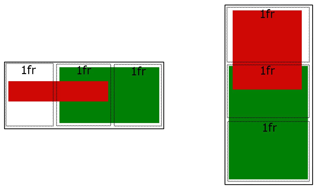
Is this behavior possible with css grid? Here is how far I got but now I'm stuck trying to get the vertical overlap.

CSS

.wrapper {
  background: white;
  display: grid;
  grid-template-columns: repeat(auto-fit, minmax(444px, 1fr));
}

.wrapper__red, .wrapper__green {
  align-self: center;
}

.wrapper__red {
  z-index: 1;
  background: red;
}

.wrapper__green {
  justify-self: end;
  height: 100%;
  background: green;
}

HTML

<div class="wrapper">
  <h1 class="wrapper__red">Title text goes here</h1>
  <img class="wrapper__green" src="/a.jpg" />
</div>
See Question&Answers more detail:os

与恶龙缠斗过久,自身亦成为恶龙;凝视深渊过久,深渊将回以凝视…
thumb_up_alt 0 like thumb_down_alt 0 dislike
499 views
Welcome To Ask or Share your Answers For Others

1 Answer

In CSS Grid you can create overlapping grid areas.

Grid makes this simple and easy with line-based placement.

From the spec:

8.3. Line-based Placement

The grid-row-start, grid-column-start, grid-row-end, and grid-column-end properties determine a grid item’s size and location within the grid by contributing a line, a span, or nothing (automatic) to its grid placement, thereby specifying the inline-start, block-start, inline-end, and block-end edges of its grid area.

note: re-size demo below to transition from desktop to mobile view

article {
  display: grid;
  grid-template-columns: repeat(6, 1fr);
  grid-auto-rows: 50px;
  grid-gap: 5px;
}

section:nth-child(1) { grid-column: 1 / 4; grid-row: 1; z-index: 1; }
section:nth-child(2) { grid-column: 3 / 5; grid-row: 1; }
section:nth-child(3) { grid-column: 5 / 7; grid-row: 1; }

@media ( max-width: 500px ) {
   article { grid-template-columns: 100px; justify-content: center; }
   section:nth-child(1) { grid-row: 1 / 4; grid-column: 1; }
   section:nth-child(2) { grid-row: 3 / 5; grid-column: 1; }
   section:nth-child(3) { grid-row: 5 / 7; grid-column: 1; }
}

/* non-essential demo styles */
section:nth-child(1) { background-color: lightgreen; }
section:nth-child(2) { background-color: orange; }
section:nth-child(3) { background-color: aqua; }
section {
  display: flex;
  justify-content: center;
  align-items: center;
  font-size: 1.2em;
}
<article>
  <section><span>1</span></section>
  <section><span>2</span></section>
  <section><span>3</span></section>
</article>

与恶龙缠斗过久,自身亦成为恶龙;凝视深渊过久,深渊将回以凝视…
thumb_up_alt 0 like thumb_down_alt 0 dislike
Welcome to ShenZhenJia Knowledge Sharing Community for programmer and developer-Open, Learning and Share
...